Your product catalog is the skeleton of your store. Shoppers rarely think about it consciously, but they feel it in every moment of friction: when a collection buries the item they wanted, when filters return nothing, when two nearly identical products sit in different corners of the site. Search engines feel it too, because the way you group and link products shapes what gets crawled, indexed, and ranked. Getting the structure right early saves you from painful migrations later, when hundreds of URLs and internal links depend on decisions you made without much thought.
This guide walks through how to think about catalog architecture as an operator, not a theorist. The goal is a structure that a first-time visitor can navigate without instructions, that scales as you add products, and that gives search engines clean, stable signals about what each page is for.
Start With How People Shop, Not How You Stock
The most common catalog mistake is organizing the store around internal logic instead of buyer intent. You might track inventory by supplier, by the order in which products arrived, or by internal SKU families. None of that matters to a shopper. They arrive with a need, a use case, or a rough idea of a category, and they want the shortest path from that idea to a product page.
Before you build anything, write down the handful of ways a real customer might describe what they are looking for. Some shop by category (“running shoes”), some by attribute (“waterproof”), some by occasion or problem (“something for a wet commute”), and some by recipient (“a gift for a runner”). Your catalog needs to accommodate more than one of these mental models at once, which is exactly why categories and collections are different tools that work together.
Categories Versus Collections: A Practical Distinction
It helps to separate two ideas that platforms often blur. A category is the primary, structural home of a product — the one place it fundamentally belongs. A collection is a curated grouping that pulls products together around a theme, attribute, or moment, and a single product can appear in many collections at once.
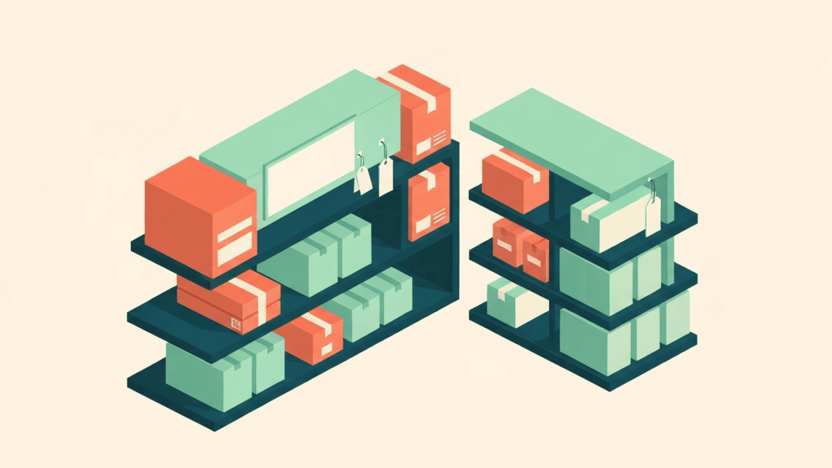
Think of categories as the permanent floor plan of a physical store, and collections as the seasonal end-caps and themed tables you set up on top of that floor plan. A jacket lives in “Outerwear” as its category. It might also appear in “New Arrivals,” “Waterproof Gear,” and “Gifts Under a Certain Budget” as collections. The category gives the product a stable address; the collections give shoppers multiple doors into it.
Why the distinction matters for URLs
Decide early which grouping owns the canonical product URL. If the same product is reachable through several collection paths, you want one authoritative address and consistent internal linking toward it, so ranking signals concentrate rather than scatter. Muddying this from day one is one of the harder things to untangle at scale.
Design a Shallow, Logical Hierarchy
Depth is the enemy of discovery. Every extra level a shopper has to click through is another chance to lose them, and deeply nested pages tend to receive fewer internal links, which weakens them in search. As a working rule, aim to let a visitor reach any product within a small number of clicks from the homepage.
A clean hierarchy usually looks like a modest number of top-level categories, each with a manageable set of subcategories beneath it, and products at the bottom. Resist the urge to create a subcategory for every possible slice of the catalog. If a subcategory would hold only one or two products, it probably should be a filter or a collection instead of a permanent branch of the tree.
- Too flat: hundreds of products dumped into a handful of giant categories, forcing shoppers to scroll endlessly and rely entirely on filters.
- Too deep: five or six levels of nesting where each page holds only a few items, spreading your catalog thin and burying products.
- About right: broad top-level categories, meaningful subcategories that each hold a healthy number of products, and filters to handle the finer slicing.
Let Filters Do the Fine-Grained Work
Attributes such as size, color, material, price band, and use case are almost always better handled as filters than as separate categories or collections. Filters let a shopper combine constraints (“blue,” “medium,” “under a certain price”) without you having to pre-build a page for every combination, which would create an unmanageable sprawl of thin, near-duplicate pages.
The catch is that filters can generate enormous numbers of URL variations if each filtered view is crawlable and indexable. Left unchecked, this produces index bloat: thousands of low-value, overlapping pages competing with each other. Work with your platform’s controls to keep the vast majority of filter combinations out of the index, and reserve indexable, well-structured landing pages only for the filtered views that represent genuine, high-demand search intent.
When a filter deserves its own page
Occasionally a filtered view maps so cleanly onto how people search that it earns a dedicated, indexable collection page — think a color or material that customers actively search for by name. Treat these as deliberate exceptions with real content and internal links, not as an automatic side effect of every filter.
Name and Slug Things for Humans and Machines
Category and collection names should match the language your customers actually use, not internal jargon or clever branding. If shoppers search for a plain term, name the category that plain term. The same applies to URL slugs: keep them short, readable, lowercase, and descriptive, and once a URL is live, treat changing it as a decision with consequences, because every change risks breaking links and requires careful redirects.
Consistency is its own feature. Decide on conventions — singular or plural, how you handle multi-word terms, how you separate words in slugs — and apply them everywhere. A predictable pattern makes the whole store feel more trustworthy and makes your own maintenance far easier.
Write Real Content on Category and Collection Pages
A category or collection page is not just a grid of products. It is often the page most likely to rank for a broad, high-intent search, so it deserves genuine supporting content. A short, useful introduction that explains what the grouping contains and helps shoppers choose gives both people and search engines a reason to value the page. Avoid keyword-stuffed filler; write the couple of sentences you would actually say to a customer standing in that aisle.
Internal linking from these pages matters as much as the copy. Link related categories and collections to one another where it genuinely helps navigation, so a shopper browsing one grouping can naturally discover adjacent ones, and so ranking signals flow through the structure instead of dead-ending.
Plan for Growth and Change From Day One
Catalogs are living things. Products get discontinued, seasons end, and new lines launch. Decide in advance what happens to a URL when a product or collection retires: whether it redirects to the closest relevant page, and how you avoid leaving shoppers and crawlers stranded on dead ends. Handling this consistently protects the equity you have built and keeps the experience clean as the catalog turns over.
Finally, revisit the structure periodically. Watch where shoppers land, where they drop off, and which internal searches return nothing — those empty searches are a direct list of collections or categories your customers expect but cannot find. Let real behavior, rather than assumptions, guide how the catalog evolves.